

Tuesday, December 31, 2013
Monday, December 30, 2013
Color Scheming

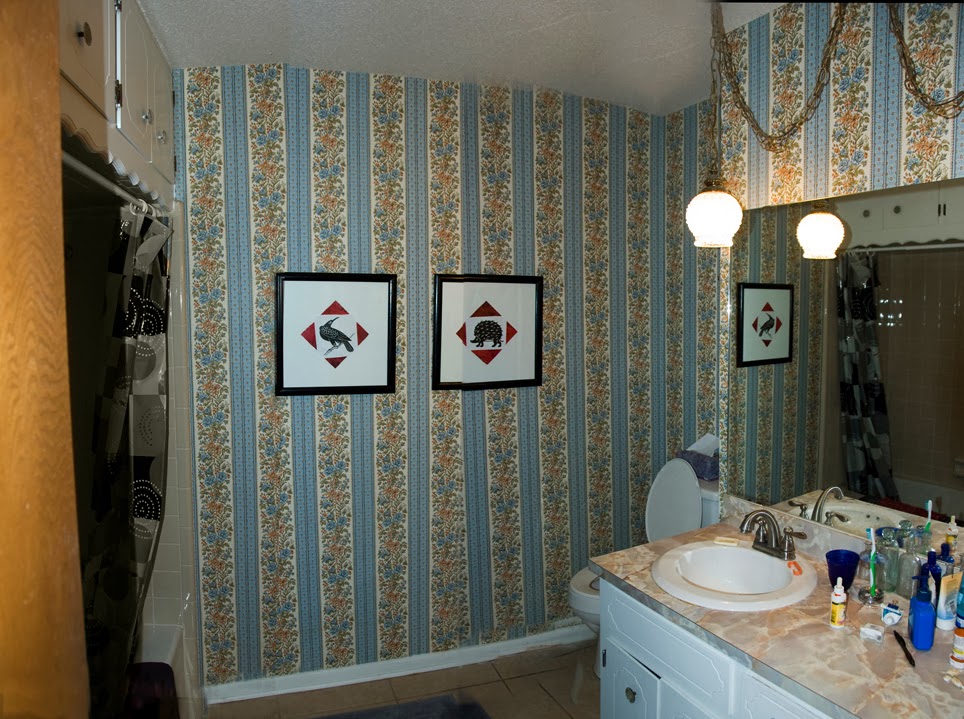
I've been "out of commission" for a few weeks with a pulled muscle & pinched nerve, so I've been doing all my bath remodeling planning on the computer. Above is a closer look at some of the color combos in my bath. Warm gold pulls with cool silver fixtures. Warm beige tiles & wallpaper with cool white porcelain tub and blue toned white paint on the vanity. Floral wallplate adding to the confustion with yellow tones.
I've looked at hundreds of examples of beautiful bathrooms wondering how to create a pleasing color scheme out of this jumble. I decided to create a chip chart of the things I would not change and go from there. I used Valspar's color selector for most of my chips.
I would not remove the tile on the floor and around the tub, nor the white sink and tub, nor the formica countertop. To match the existing silver fixtures I decided to replace all the drawer pulls with simple chrome pulls. To make the sink and tub look whiter and brighter I decided to paint the vanity black and chose an off white paint for the walls. Below is my computerized color chart. I still need to pick up some printed chip charts and match them to the real thing.

Still doing the computer thing I picked swatches of art and fabric I like, chose colors from the Valspar Paint site, and added them to my basic chart. It seems to me my basic chart is now a warm neutral beige and any number of colors might be used.
The first chart is my favorite. I could frame the multicolored poster, add a red or orange or yellow shower curtain, and pop everything with turquoise accessories. If I get tired of the colors in a few years, I could just switch out the art and coordinate accessories as needed.


Sunday, December 29, 2013
out with the old
My goal for 2014 is to make over the bath for under $500. Several months ago I replaced the original 5-gallon toilet with a new 1.2 gallon model, so I'm not counting that. I've already seen savings on my water bill, so I think it will soon pay for itself.
More to come as things progress.
Monday, December 16, 2013
Fa-La-La

Ooops, this card didn't turn out as well as I'd hoped. It looks better as a scan than it does in reality. The background came from a block-printed fabric that was once a bedspread that later became curtains that finally had too many holes in it to be much use. I used gel medium to glue it to a piece of cardboard, then tried to stencil letters and designs onto it. Unfortunately the fabric is so loosely woven the paint spread so the letters weren't clear. I used a marker to try to sharpen them up but they're still pretty blurry. I only made this one card. I'll make more later, but without stencils.
Sunday, December 15, 2013
Xmas Cards


I had some colorful scraps of paper left over from wrapping presents, so I experimented with them.
I don't know why I haven't thought of this before; I love Christmas colors and this lightweight paper works really well with glue stick or gel medium!
Saturday, December 7, 2013
Spatter serendipity

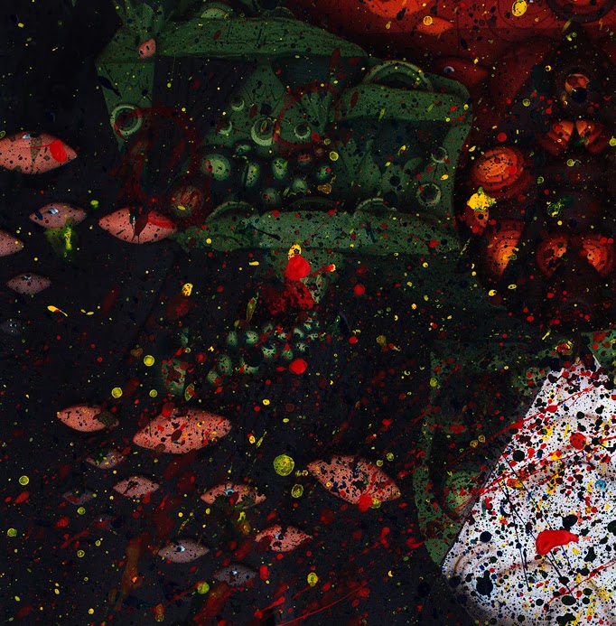
I had a bright orange envelope I wanted to recycle, and I thought I'd try spattering some paint on it to cover some unwanted advertising. This is where you get some slightly watered-down paint on a brush and tap the brush perpendicularly against a stick or whatever. I had an old magazine open under the envelope to catch the "overspray," and I noticed the spattering looked nice on a dark area of the page, so I decided to do several whole pages like that. Above is one result. The spatters nicely cover the original art on the page while some of the original color shows through. I might use this for Christmas cards. Below, I see lots of little Space-fish swimming through the Milky Way.
This is very, very messy. I spread paper all over my desk and still got spatters everywhere; on me, on my clothes, on the wall. Here's the piece of 2x4 I played with the brush. I feel like the hippie version of Jackson Pollack.

Friday, December 6, 2013
Fractal part 1

Talk about having to let go of my creation! I'm able to send away my collage postcards, I think, because I have a distant subconscious hope the recipient will keep it because they enjoy it. (That's what I do with postcards I get. I have a rotating display on a little shelf above my desk.)
Knowing your work will be deliberately cut up is another thing entirely.
I'm excited to see what the results will be.
Subscribe to:
Posts (Atom)